Key points at a glance
- Google uses the mobile version of your website for indexing and ranking; anything missing there does not count.
- Phone number and address must lead to a call or directions with a single tap.
- At least 16 pixels for body text and buttons that can be hit reliably with a thumb.
- Contact forms on the phone: few fields, the right keyboard, no puzzle captchas.
- Test on real devices, not just in a shrunken browser window at your desk.
This post is general information, not legal or tax advice for your individual case. Laws, professional guidelines and chamber fees change: check the details with your chamber, the relevant authority or your professional association before you make a decision.
Why the smartphone comes first
Local searches such as “Notar in der Nähe” (notary near me), “Scheidungsanwalt Graz” (divorce lawyer Graz) or “Steuerberater Köln Ehrenfeld” (tax adviser Cologne Ehrenfeld) very often happen on the go. Someone holding a dismissal letter or a letter from the tax office reaches for their phone, not their laptop. How high the share is for you can be seen in your own statistics or in Google Search Console with the device filter. For many firms, a large share of visits comes from smartphones.
Then there is the search engine itself. Google works with mobile-first indexing: for indexing and ranking, Google uses the mobile version of a page, fetched with the smartphone crawler. Content, headings, image descriptions and structured data that only appear in the desktop view may not be seen by Google. The mobile view is therefore not a stripped-down side version but the main version of your website.
Tap to call and tap for directions
On a smartphone, the website is often just the short route to the phone. Anyone who wants to call should not have to copy down or memorise the number. That sounds obvious, but it fails surprisingly often on details.
- Phone number as a link: every number on the website is a call link in international format, i.e. with +43 or +49. That way it also works for clients with a foreign mobile contract.
- No numbers as images: a phone number in a graphic can neither be tapped nor copied, and search engines cannot read it.
- Address with a map link: tapping the address opens navigation. Add what helps on site: staircase, floor, doorbell, parking, nearest stop.
- Email as a link: a tappable address is more convenient than a form when someone just wants to move an appointment.
- State when you are available: next to the number, say when someone answers. A call into the void at 6 pm is more frustrating than a clear note on telephone hours.

Be careful with messenger buttons. A link to WhatsApp is quickly added, but client matters do not belong in a messenger without careful thought. The duty of confidentiality and data protection apply to the first contact too. If you offer a messenger, do so with a clear note that no documents or case details should be sent there.
Readable text and buttons that are easy to hit
On a phone, people operate with their thumb and often read while walking. Text that is too small, contrast that is too pale and links crowded together make any page hard work. The following values have proved themselves.
| Element | Guide value | Why |
|---|---|---|
| Body text | at least 16 pixels, line height about 1.5 | Readable without zooming, even for longer texts on deadlines or procedures |
| Input fields | at least 16 pixel font size | Below that, Safari on the iPhone automatically zooms into the field when tapped and shifts the page |
| Buttons and links | at least 24 × 24 pixels under WCAG 2.2, better about 44 to 48 pixels | Apple recommends 44 points, Google 48 dp for Android; that is easy to hit with a thumb |
| Spacing between links | enough room so that target areas do not touch | Prevents the legal notice from opening instead of “Contact” |
| Contrast | dark text on a light background, no light grey on white | Otherwise barely readable outdoors in sunlight |
Good readability is also part of accessibility. Which requirements apply and to whom the accessibility acts in Germany and Austria apply is explained in the guide to the accessible firm website.
The menu on the smartphone
On the desktop, a menu bar with seven items fits; on the phone it folds away behind a menu icon. The fewer the items, the faster visitors find what they are looking for. A firm usually manages with five or six main items: practice areas, team, guides or news, contact, and careers if needed.
How to get it right
- Show contact details and the phone number in the open menu too
- Open submenus with a tap, with a clearly visible arrow
- Give the menu a large close button
- Use your clients' words: “inheritance law” rather than “succession planning”
Better avoid
- Menus that only open when hovering with a mouse
- Three-level submenus with 30 entries
- Making the legal notice or the privacy policy hard to find; both must remain easy to reach
- A menu icon that is barely visible on a light header image
The legal notice (Impressum) must be easily recognisable and directly accessible on the phone too, in Austria under § 5 ECG and § 25 MedienG, in Germany under § 5 DDG. A link in the footer that appears on every page is enough. Which details your profession needs is set out, for example, in the guides to the mandatory information for lawyers in Austria or for tax advisers in Germany.
Forms and the contact button
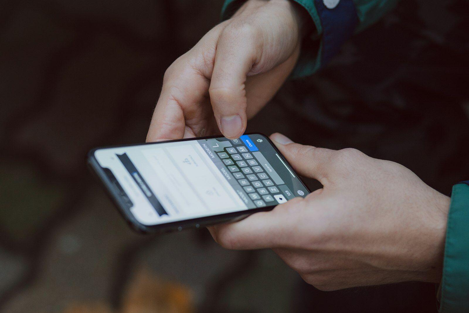
A contact form that looks harmless on the desktop quickly becomes a hurdle on the phone. Every field means typing on a small keyboard. Only ask for what you really need for the first reply.
Few fields
Name, phone or email and a short message. Clarify the details of the case in conversation; that is also better in terms of confidentiality and data minimisation.
The right keyboard
The phone field opens the number pad, the email field a keyboard with @. With the right markup, the browser fills in known details automatically.
Label above the field
Placeholder text inside the field disappears as you type. A label above the field stays visible and also helps screen readers.
No puzzles
Picture-puzzle captchas are torture on a phone. Invisible spam protection methods keep out most spam just as well.
Clear confirmation
After sending, the page shows clearly that the message has arrived and when you will get back to the sender.
A permanently visible contact button at the bottom of the screen, for example “Call” and “Request an appointment”, makes sense on firm websites. But it must not cover the content or sit on top of the footer and legal notice. Pop-ups that fill the entire screen on opening are a different matter: Google advises against such intrusive interstitials, and visitors usually close them unread. If you allocate appointments online, the guide to online appointments describes how to make this work smoothly on the phone; what the contact page as a whole should look like is covered in the guide to the contact page.
PDFs or pages?
Many firms put checklists, information sheets, fee information or power of attorney templates online as PDFs. On a phone, a PDF is tedious: it opens in a separate app, the text is tiny, and you have to zoom and scroll sideways. Content that people are meant to read therefore belongs on the website as a normal page. That also helps with Google, because a page with headings and links is easier to understand.
- As a page: checklists for the first meeting, document lists for the tax return, how a mediation works, information on costs and fees.
- Additionally as a PDF where useful: forms to print and sign, powers of attorney, information sheets that clients want to file.
- Tables: show wide tables, such as deadlines or fees, as a list on the phone or make them scroll sideways without the whole page shifting.
Testing on real devices
The browser's developer tools simulate a smartphone quite well, but they do not replace a test on a real device. Only in your hand do you notice whether your thumb reaches the menu, whether the text is readable in the sun and whether the page loads quickly over mobile data. How fast your page really is is covered in the guide to page speed for firm websites.
The ten-minute phone test
- Website opened on an iPhone and an Android device, each also turned sideways
- Phone number tapped: does the call start?
- Address tapped: does navigation open?
- Menu opened, every item reached and closed again
- Contact form completely filled in and sent on the phone
- Page cannot be shifted sideways anywhere, no cut-off tables
- Legal notice and privacy policy reachable from every page
- Page loaded over mobile data instead of Wi-Fi
Also check how your firm looks on the phone before anyone clicks: page titles and descriptions wrap differently in mobile search results than on the desktop. With the Google preview you can see both views side by side.
A firm website built for the phone first
Our firm websites are designed for the smartphone from the start: call and directions with a single tap, easily readable text, large buttons and short forms. Request a free preview and open it straight away on your phone.
A no-obligation preview of how your firm website could look with us.
Sources
- Google Search Central – Mobile-first indexing best practices
- Google Search Central – Avoid intrusive interstitials and dialogs
- web.dev – Responsive web design basics
- W3C – WCAG 2.2, Success Criterion 2.5.8 Target Size (Minimum)
- Apple – Human Interface Guidelines: Accessibility
- Android Developers – Make apps more accessible (48 dp touch targets)
- IETF – RFC 3966: The tel URI for telephone numbers
- RIS – E-Commerce Act § 5 (general information obligations)
- RIS – Mediengesetz § 25 (disclosure)
- Digitale-Dienste-Gesetz (DDG) § 5 (general information obligations)